Hangry! | Foodie Chatbot *On-Going Project*
Tools Used: Adobe CC, Google Sheets, Pen & Paper, Chatfuel platform.
Role: UX Research, Branding & Visual Design.
Role: UX Research, Branding & Visual Design.
Overview
The idea for Hangry came from a conversation I was having with some friends who were visiting the city. They asked me where were the places my wife and I liked to eat since we would post to IG and Facebook places we would try out. Originally I created pdf, but that quickly became confusing as I tried to organize all the places we had been into separate categories. I had also been researching and testing out some different chatbots and decided to try out the idea of a local foodbot. It got great feedback from my friends and I decided to scale it up and see if there would be interest from others.
Research & Planning.
For my initial research I referenced these articles on the topics of Conversational UI and keeping users engaged.
"Making Chatbots Talk — Writing Conversational UI Scripts Step by Step"
"Conversational UI Principles — Complete Process of Designing a Website Chatbot"
"6 UX Tips for Designing Your Best Chatbot"
"Conversational UI Principles — Complete Process of Designing a Website Chatbot"
"6 UX Tips for Designing Your Best Chatbot"
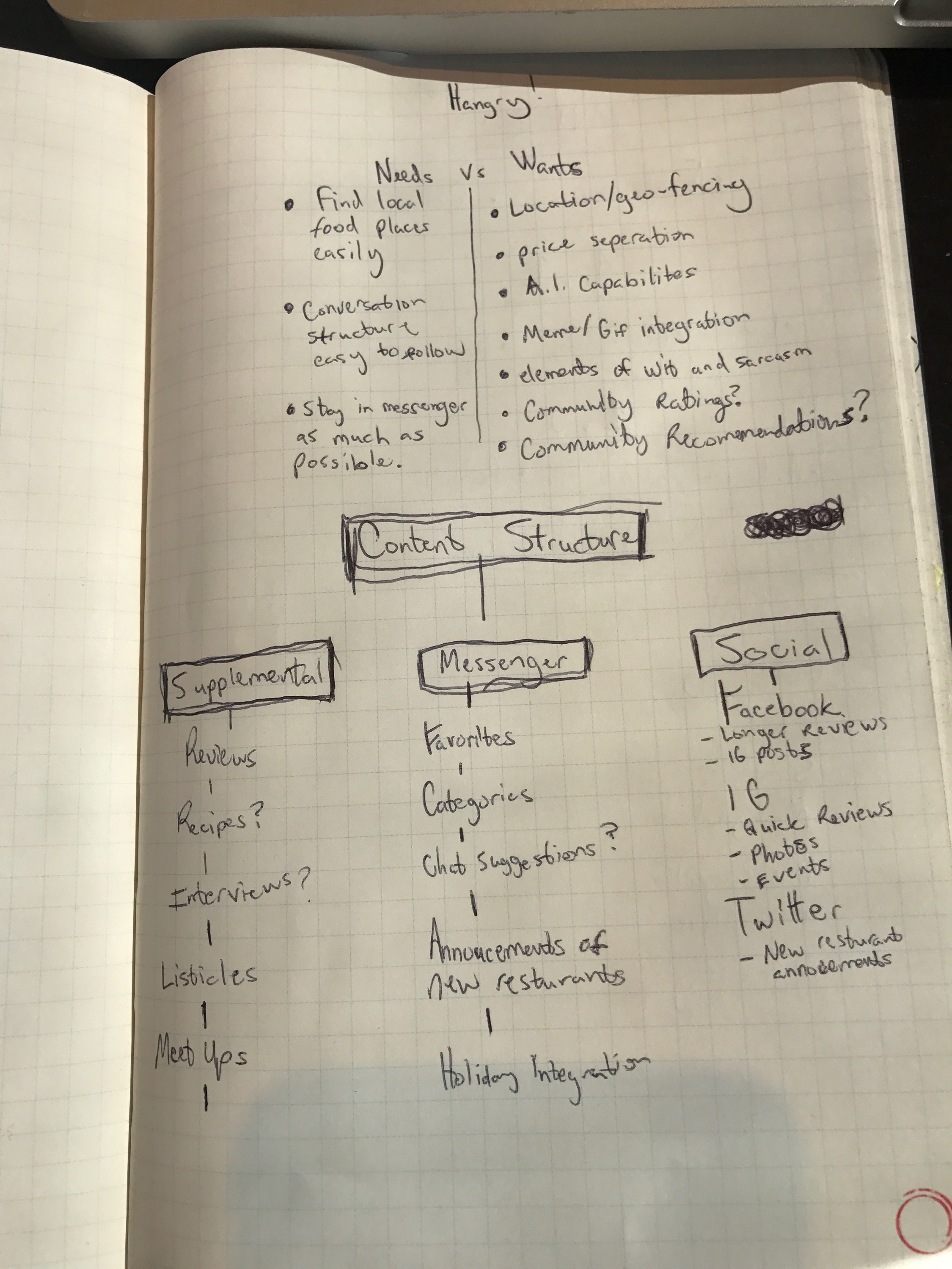
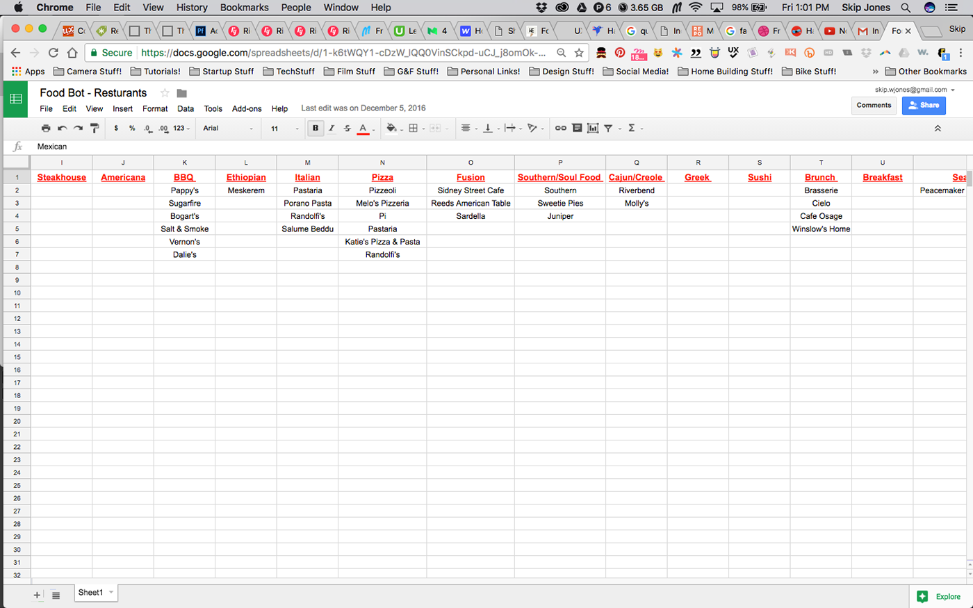
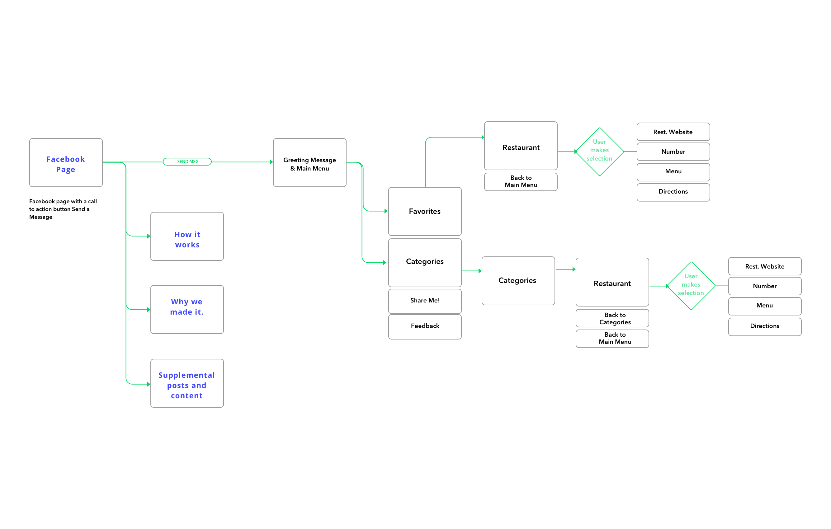
Next I began to brainstorm some goals for the chatbot. I'm approaching this in a iterative format as I'm learning a lot about Conversational UI's as I'm designing and building. I used Google Sheets to organize the restaurants into categories and then created a flow chart of how the user should go from one stage to the next.
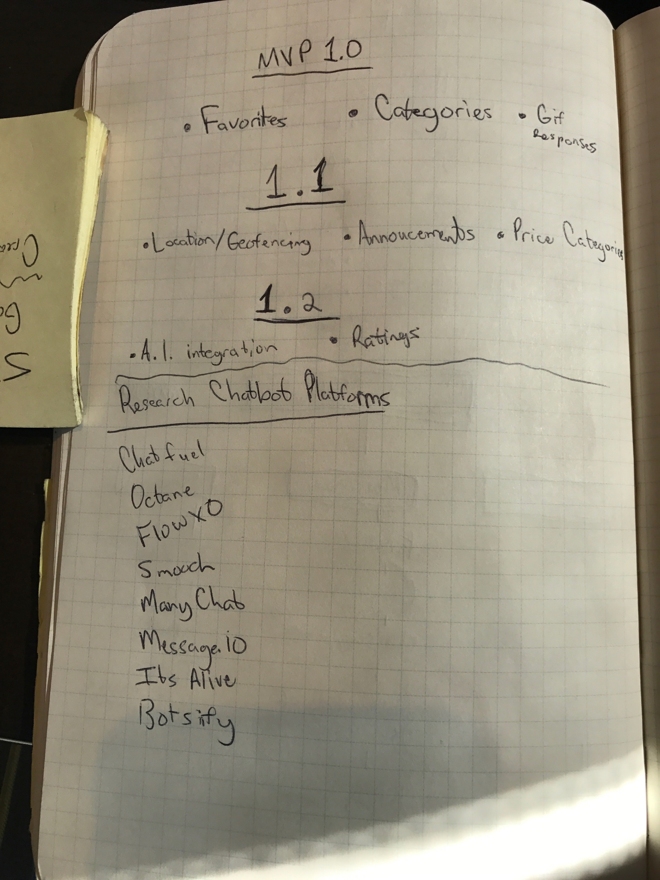
MVP SCOPE
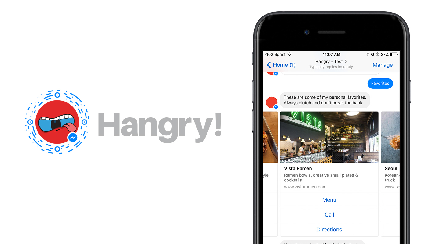
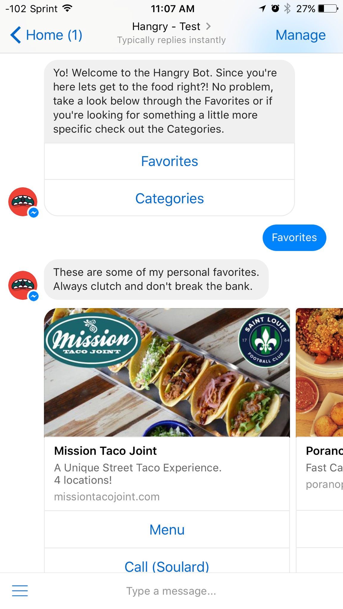
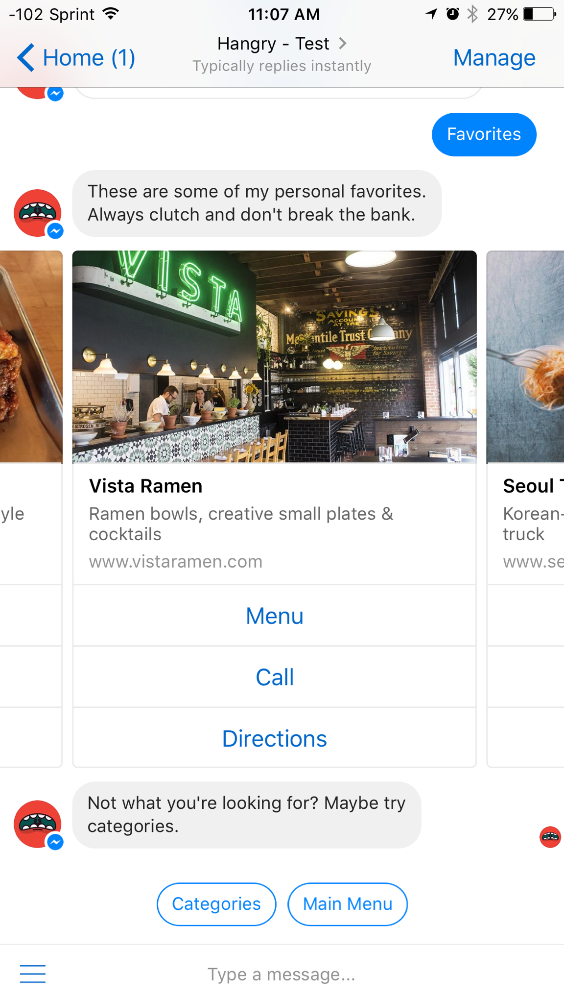
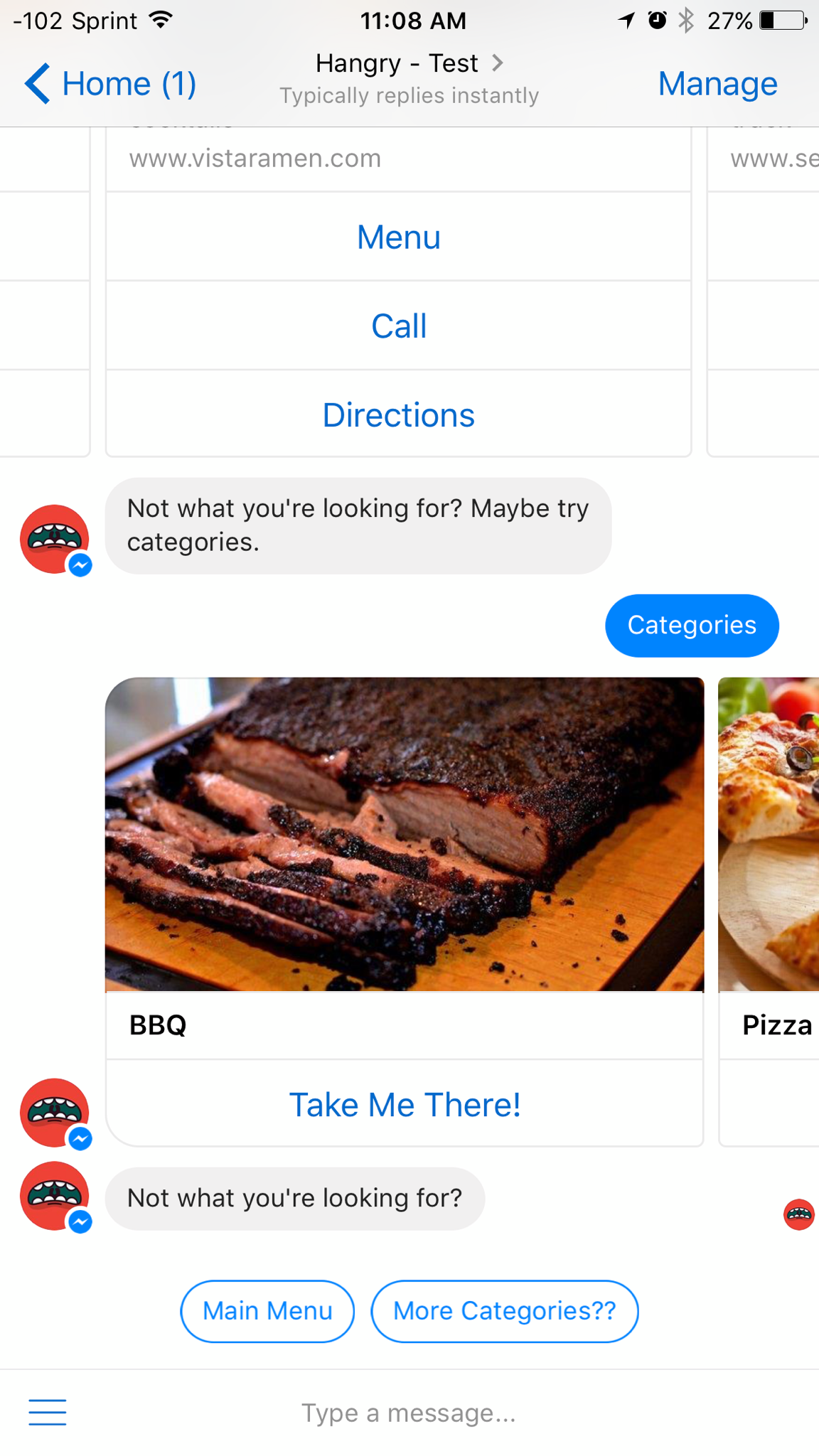
For the version 1 I wanted users to be able to simply find restaurants via two channels "Favorites", curated selection, and Categories, that offer more choice and options. I also thought the core functions needed to be able to see the menu, number to call, and directions.
Features for the next iterations I plan to implement: Geofencing/Location based eateries, Pricing categories, and AI implementation so users have a more personal experience.
Branding. & Web Design
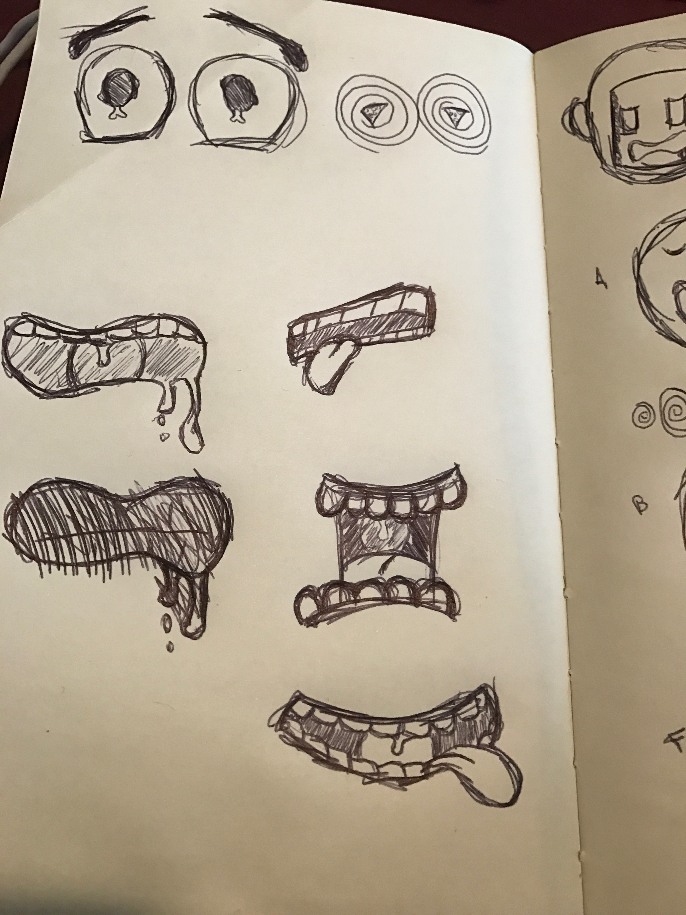
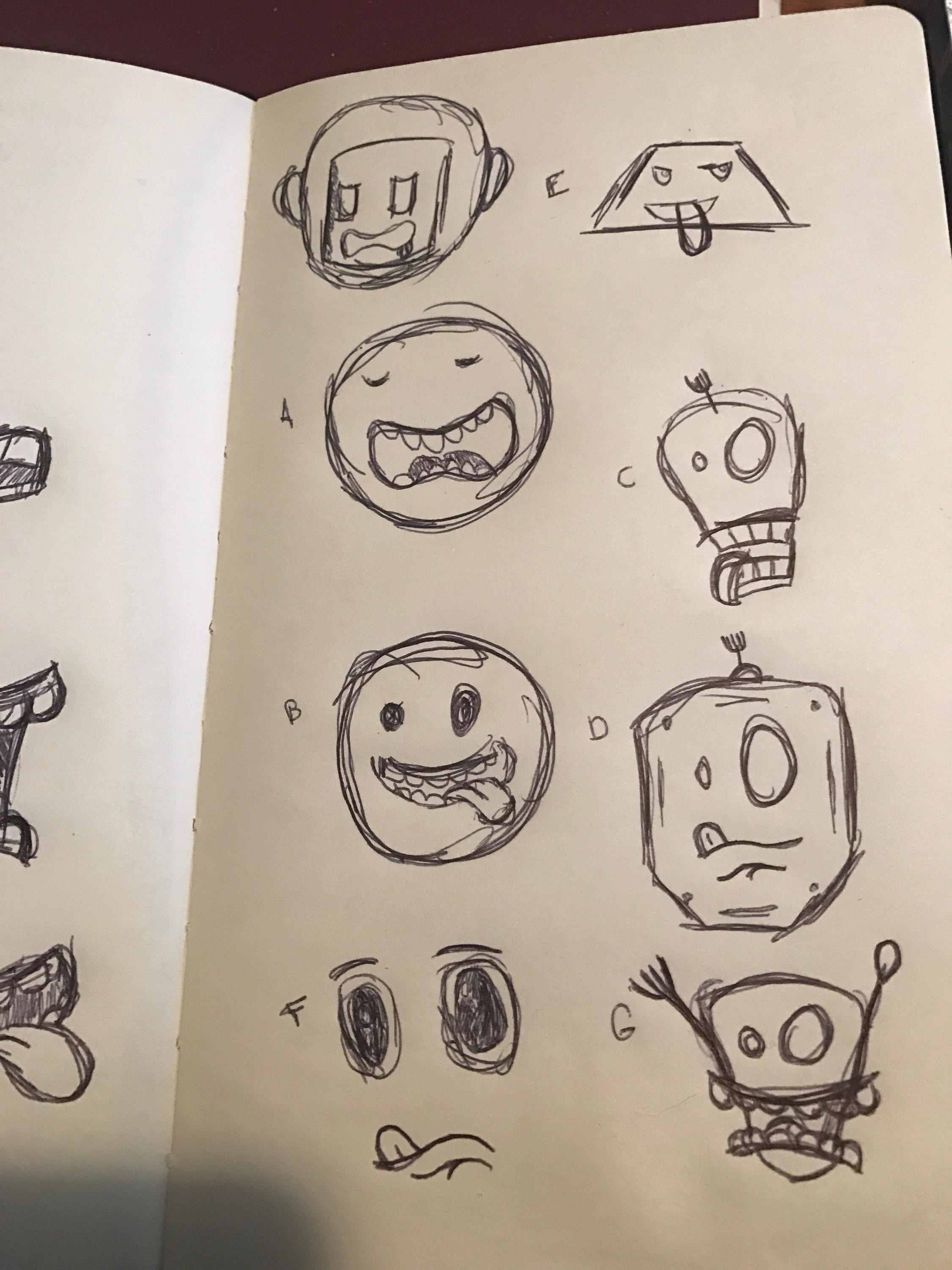
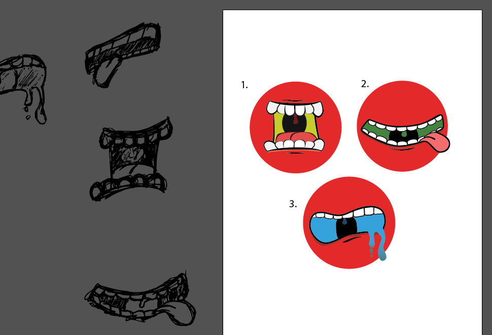
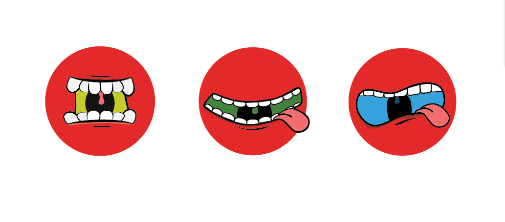
For the logo and branding I wanted to visualize what it really means to be HANGRY. I started off with sketches that focused on trying to make it look more bot-like but soon realized I didn't want the focus of Hangry to be just the bot but the food experience over all. From there I took my sketches into illustrator to polish them up. Ultimately I went with a variation of two of my sketches and chose Aileron for my main typeface.
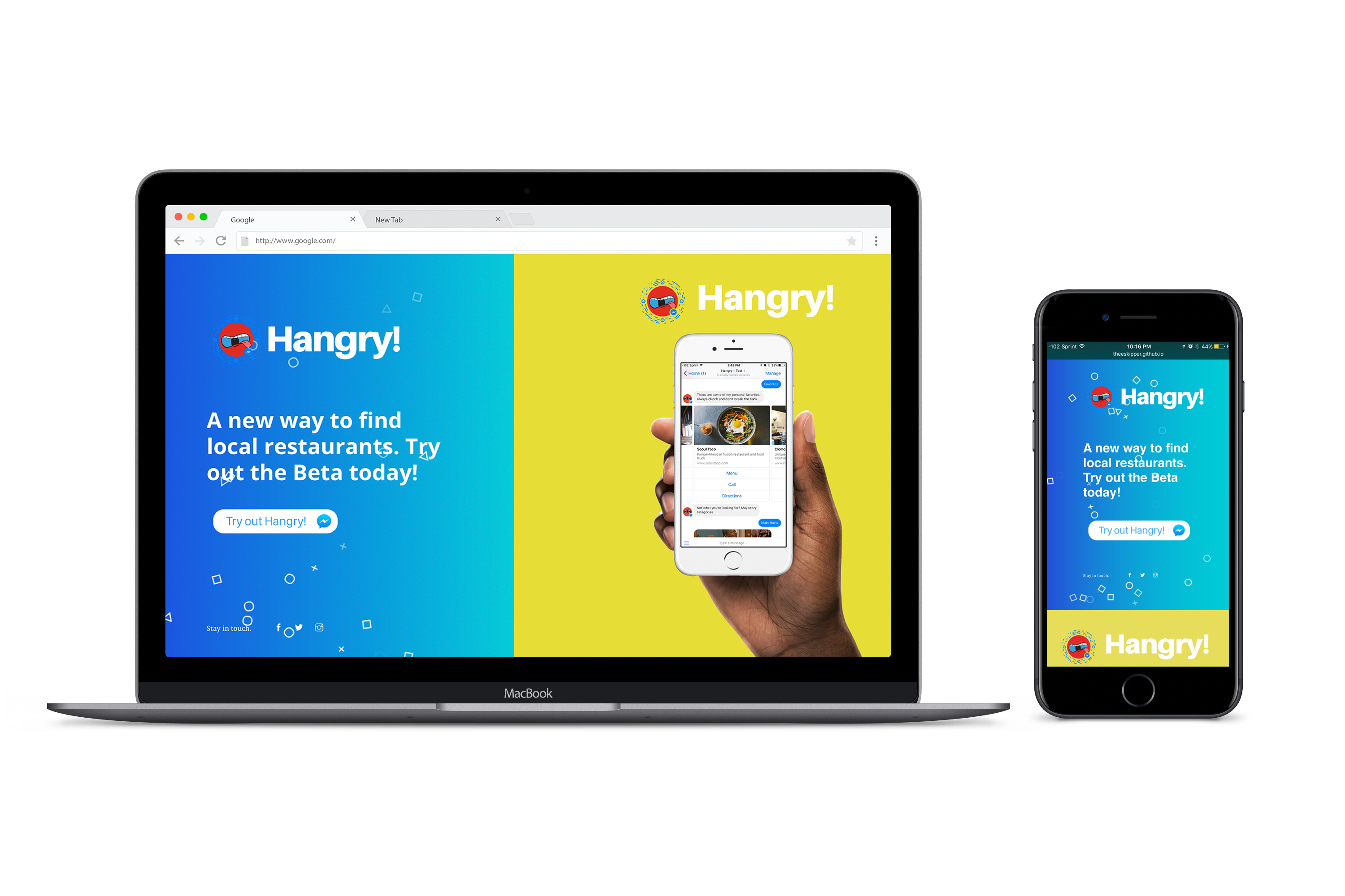
For the landing page I went with a simple split screen design with a single call to action for the beta.
Check out the landing page here!